color coded
Renowned Miami designer oscar glottman uses a continuum condo as a showcase for the common grounds between art and design.
Text by: Beth Bunlop
Photos courtesy of: Robin Hill
published by modern luxury miami | view original article | web article
In Oscar Glottman’s hands, wood is not mere wood, stone is not just stone. For Glottman, a master of textures and materials, the basics of design are all elements in a larger composition; they are structural, visual, visceral. “I’m interested in exploring the textures inherent in contemporary materials,” he says.
The Colombia-born Glottman, 45, is a University of Miami-trained architect sought for his original, crisp, sparkling interio,·s. In Milan, where the most intriguing new furniture designs are introduced every year at shows like Salone, he is a well-known figurerespected for his astute judgment and clean aesthecic. His Design Discrict showroom has become a descination for designers and design junkies alike.
the apartment is at once rich and yet reserved, with glamorous touches befitting its location and artistic gestures that take it up a notch.
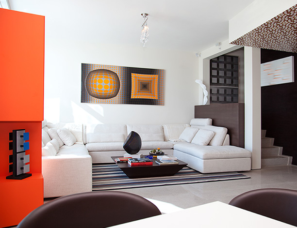
glottman’s restrained touch and refined eye show through clearly in his most recent project, a townhouse at the continuum in south beach, for a venezuela-born bachelor whose collection focuses on minimalism and op art (the genre in which geometry fools the eye into seeing motion). the collection includes paintings by carlos cruz-diez, jesus soto and victor vasarely, along with works from young artists such as andres ferrandis. the apartment is at once rich and yet reserved, with glamorous touches befitting its location and artistic gestures that take it up a notch.
the art, in fact, became the starting point. glottman sought to balance the coolness of minimalism with the vibrant colors and warmth of op art, to create a design that was at once light and spare and yet lush and habitable. “i’m inquisitive about the possibilities and the variations of the new,” he says. “but i’m loose, too, especially about the more human part of design, making rooms that people can live with and live in.”
glottman first saw the narrow, four-story townhouse apartment as an empty shell. “the space was very tight,” he says. “i needed to open it up and make it feel large.” this took a certain sleight of hand: he changed the configuration of the bare space, tucking away the staircase and elevator shaft, making use of every known square inch (and finding even more, for storage).
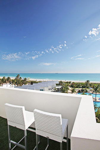
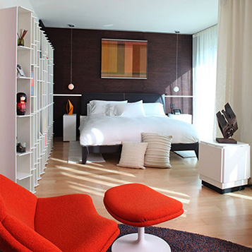
another challenge was to allow the townhouse to accommodate houseguests and yet give the owner privacy. glottman accomplished this by dividing the space into precincts, the more public on the lower floors and the private (accessed via a fingerprint-recognition security system) on the upper. today, the elegantly finished, richly furnished top-floor master suite opens out onto a capacious terrace and looks at an expanse of ocean. “the view is not very evident until you’re up higher,” glottman says.
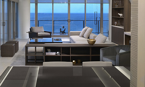
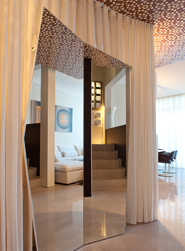
but start at ground level. step inside, and a mirrored foyer leads to the primary living space. in the large ground-floor, living-dining space (there is also a small but stylish kitchen), the design evokes the idea of the 1960s “conversation pit,” with a sectional sofa that defines the space and seems almost built-in. to further the idea that actual talking will take place, the television retracts into the wall. the dining area extends the notion of a social (and sociable) living space. the table, from tekta, is asymmetrical, and seating is a choice between chairs or a bench. “it’s not hierarchical,” says glottman.
the designer clad the walls of the dining area in wood, but not just any wood: it is a laser-cut, digitally patterned, high-pressure veneered rosewood boiserie (or paneling) from the italian design company laura meroni. it not only makes for a textured, dimensional wall but hides storage. the limestone floors (from coverings, a miami-based company) were custom-imprinted with the same pattern, alternating shiny and matte finishes on the tiles.
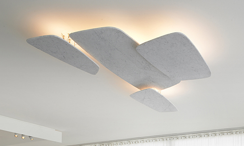
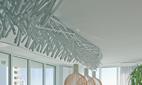
both for technical and aesthetic reasons, much of the lighting was conceived as part of the architecture. “it’s not so much about the fixture as about painting with light,” says glottman. of course, there are also show-stopping fixtures that revolve around swarovski crystals, laser-cut metal and acrylics.
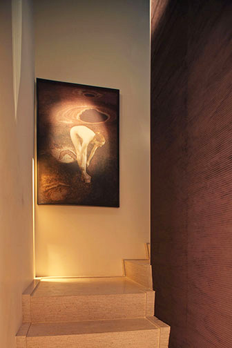
glottman’s fascination with materials includes textiles, and “not just as window treatments,” he says. the stairwell walls are a chocolate-brown corduroy velvet that reiterates the texture of the wall paneling, except that it’s soft to the touch.
“i’m exploring the layering of surfaces where they become more three-dimensional, here the textiles become architectural rather than decorative.”
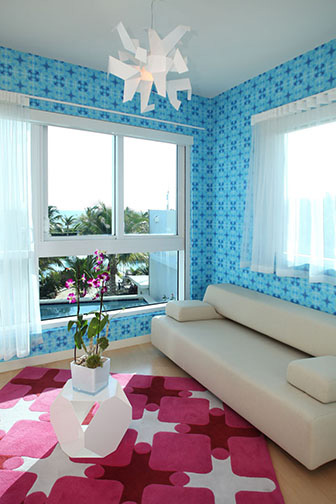
each of the guest rooms has its own personality—and vibrant color scheme—with purples, pinks and blues in the mix enhanced by lively wallpaper from two different sources: the brooklyn-based flavor paper and the british designer dominic crinson. in turn, the master suite is darker and richer with a lush, tactile feel and subtle details.
likewise, the bathrooms have clever flourishes, including glass mosaic walls, a baccarat appliquéd ceiling and, in the master bath, special led lighting and a “rain shower” that casts dancing shadows on the floor.
likewise, the bathrooms have clever flourishes, including glass mosaic walls, a baccarat appliquéd ceiling and, in the master bath, special led lighting and a “rain shower” that casts dancing shadows on the floor.
glottman’s ability to discover small companies with intriguing offerings is apparent in both his showroom and his design work. it’s a larger philosophy, a holistic idea about design. “it springs from the idea of pushing the limits,” he says, “the idea of expressing the now, the zeitgeist.”

