fbpx
glottman press florida design magazine original layout
magic touch
CLEVER LIGHT TRICKERY AND OTHER SEASONED DESIGN RUSES TRANSFORM A COCONUT GROVE APARTMENT INTO A SOPHISTICATED RESIDENCE WITH ARTISTIC DETAILS GALORE

interior architecture and design: oscar glottman
written by: lia picard
photography by: troy campbell

glottman interior architecture project
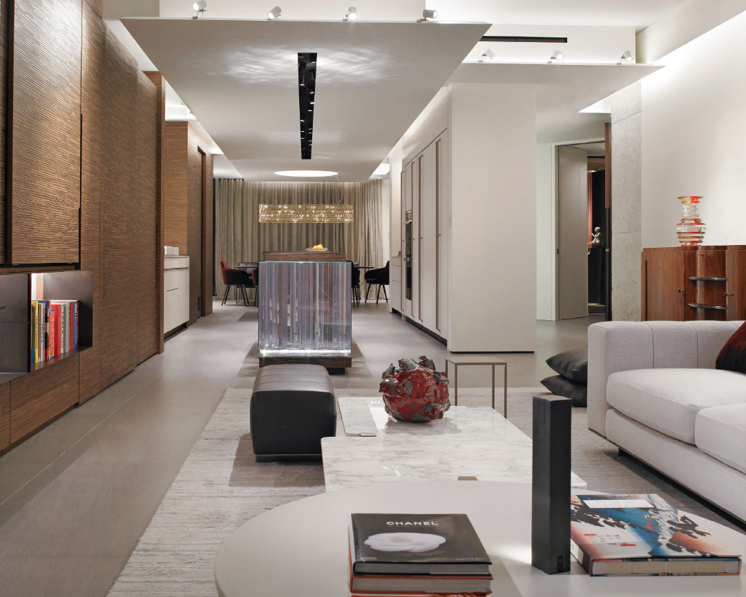
The centerpiece of this area of the residence is a prism-like cube sculpture crafted by designer Oscar Glottman. As you move around the apartment the cube dissects the space while reflecting light. “The idea was an intervention of an architectural nature, more than a decorative one,” says Glottman.

AFTER STEPPING THROUGH the pivoting front door of this Coconut Grove condo, one would be hard-pressed to believe that the 2,400-square-foot space was once dark and closed off. That’s because architect Oscar Glottman, known for “freeing projects,” performed feats of architectural sorcery to create a sleek, neutral-toned space that serves as a backdrop for his client’s art collection and maximizes the stunning views of Biscayne Bay.

Working within narrow confines with 10-foot ceilings meant that Glottman had to get creative with storage to give the impression of minimalism without sacrifice. “It became a laboratory of tricks that we had to come up with,” says the designer. One of those touches was smart storage spaces for the client’s belongings and unsightly wiring.
A horizontal plane running the length of the apartment from the living room to the dining room above the kitchen was a sophisticated way for Glottman to hide the lighting mechanics and add an eye-catching layer to the ceiling.

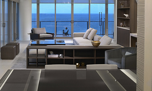
Once dark and claustrophobic, the living room now benefits from plenty of natural light thanks to what designer Oscar Glottman calls his “laboratory of tricks.”
“With light and layering, we were able to give [the apartment] a sense of depth that is mostly an optical illusion,” he says. The “cloud” of this feature is punctuated by an oculus over the dining room table where a banquette serves as a terminus to the axis. “At the same time, it allows for lounging and having conversation after dinner as if it was a living room space.”
glottman interior architecture project
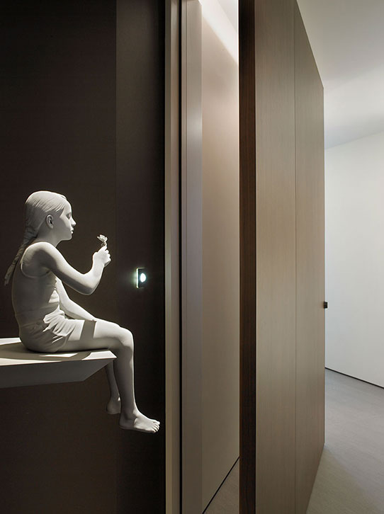
Tatiana (butterfly) by Hans Op De Beeck, a polyester, polyamede, copper, and wood sculpture, resides in the elevator foyer.
The artful use of light further enhances the sense of grandness in the intimate space. “In general, the concept of lighting is to use it as a building material and to think of it just as if it was drywall,” says Glottman, who moonlights as a lighting designer. “Light and shadow make a big impression in the way they are utilized.” In an entryway vignette, for example, Glottman placed slender Venetian glass leaves in front of equally slender recesses in the wall. “The light seeps through the cracks in the wall to illuminate the back of the Venetian glass leaves, which now kind of float in this space,” he explains. In the powder room, Glottman “painted with light” by using objects from the client’s travel collection, such as an Egyptian scarab figurine, to create shadows that can change depending on how the tiny light lenses beneath them are positioned.
custom condo interior architecture project
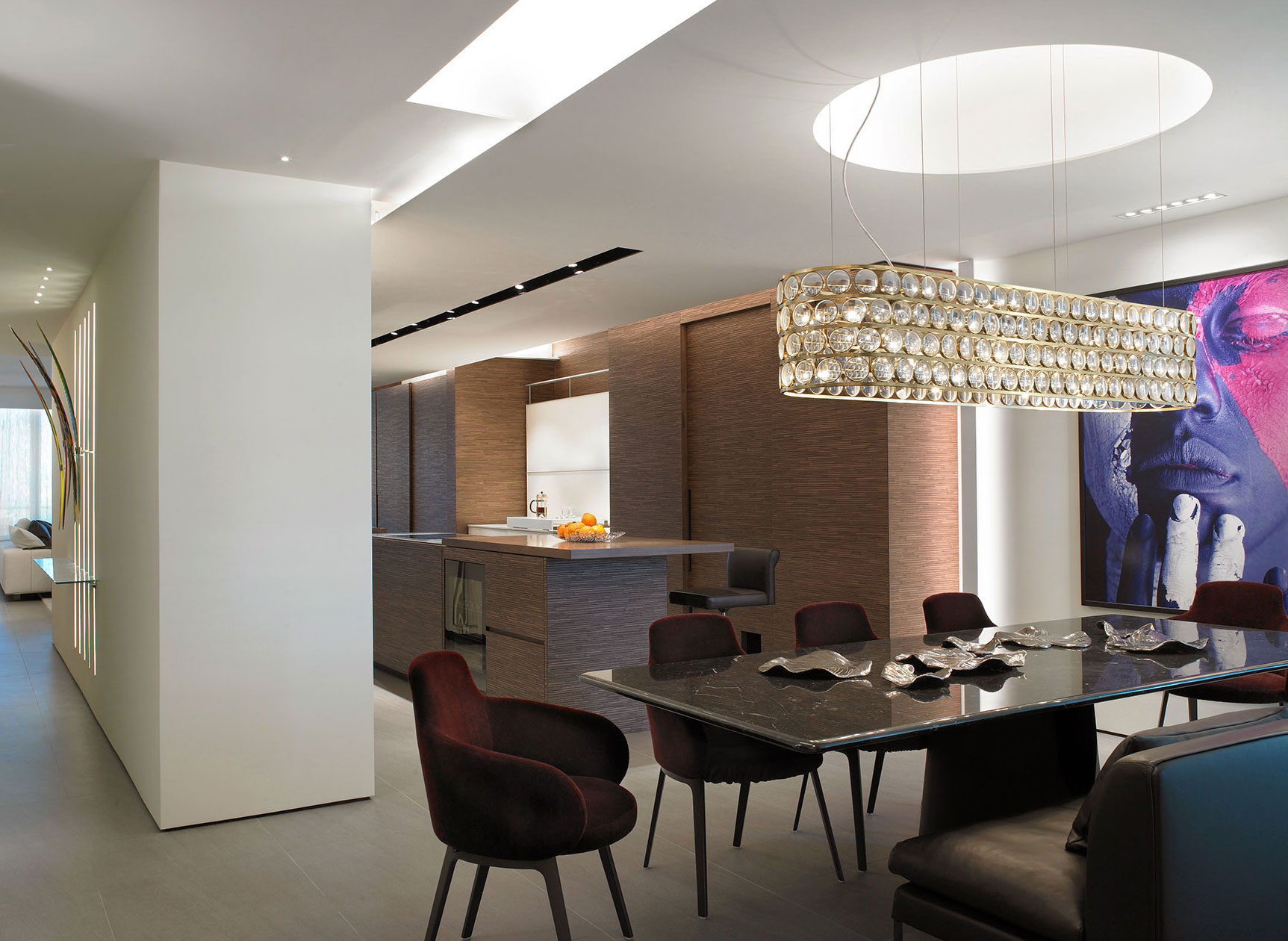
The kitchen is reminiscent of Pandora’s Box with everything, sink included, completely concealed so that it appears streamlined and free of clutter. The chandelier over the dining room table was designed by Viabizzuno and is reminiscent of magnifying glass loupes.
glottman interior architecture project guest bedroom
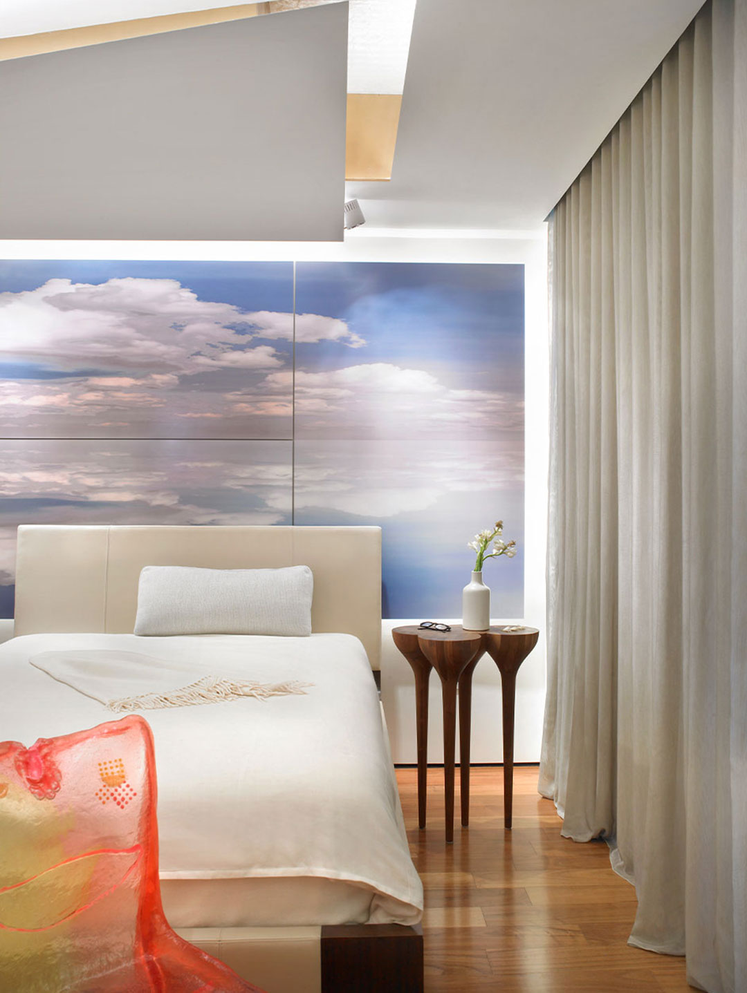
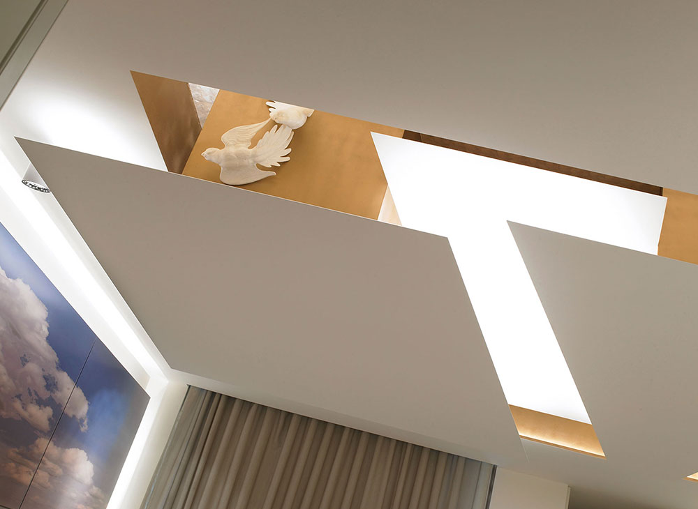
The guest bedroom has a heavenly essence thanks to the cloud photograph printed on aluminum (a Glottman original) and the gold leaf on the ceiling. The original room had a tray ceiling, so Glottman introduced a more sculptural intervention by creating floating planes that reference clouds.
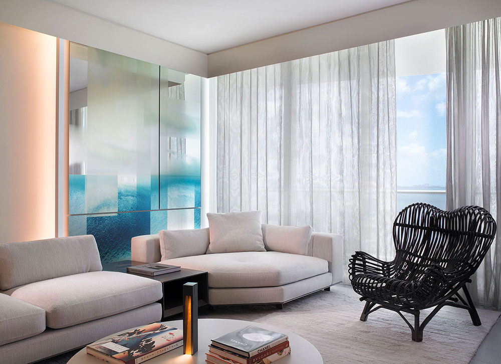
The best projects are born out of a good synergy between architect, designer, and homeowner, and this residence epitomizes that crucial relationship. “The client here enjoys the process of the design and pushed us to think of every detail of the project as a project unto itself,” says Glottman about this collaborative process, which allowed him to create four pieces of art that are woven into the home. One in particular—a dissected photograph of a sunrise printed on a floor-to-ceiling mirror placed next to a bay-facing window in the living room—plays with the lighting and accomplishes the goal of maximizing the water views.
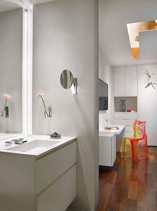
A resin chair by Gaetano Pesce offers a punchy pop of color in the guest bedroom. It’s translucent, so depending on where one stands, the light changes the colors of the piece.
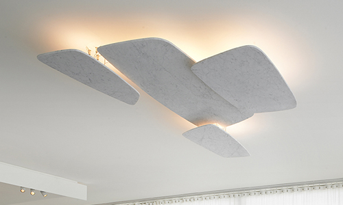
A ceiling detail in the guest bedroom using Viabizzuno lighting and bird figurines from the homeowner’s personal art collection.
The dynamic piece appears to change throughout the day as it catches the reflections of the bay and the Miami sky at various hours. “I think it’s most beautiful when it’s a cloudy day with a really blue sky filled with fluffy clouds,” says Glottman. “That’s when you truly feel the extension of the outside into the inside.”
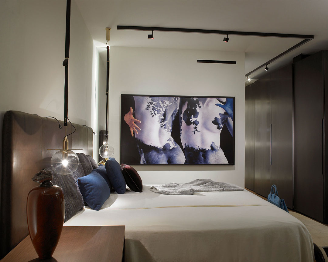
ABOVE: The primary bedroom continues the motif of natural materials with a leather headboard and brass accents. The wardrobe uses a unique lacquer finish that is brushed on, which creates a stainless steel-like finish.